Installation is the presentation of works of art. The following is a look at museum installations in New York, London, Edinburgh and Louisville that all work well in different ways. In great installations the sequence and juxtaposition of art objects presents a silent argument, making a case for the richness or provocative value of the works laid out in a gallery. Great installations give maximum value to the artworks and exploit, to that end, lighting, wall color, spacing, explanatory labels and the placement of pedestals and gallery furniture. Great installations also require that the selection of works be judicious and sustain attention and engagement. Too often exhibitions are weakened by the inclusion of mediocre work: better the A work by the C- artist than the C- work by the artist with an A reputation. Failure to consider ways of breaking open the canon of received opinion and the inability to make surprise a component of gallery arrangements are also common shortcomings. So what works?
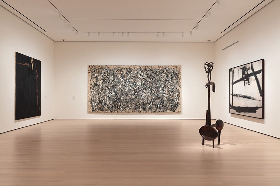
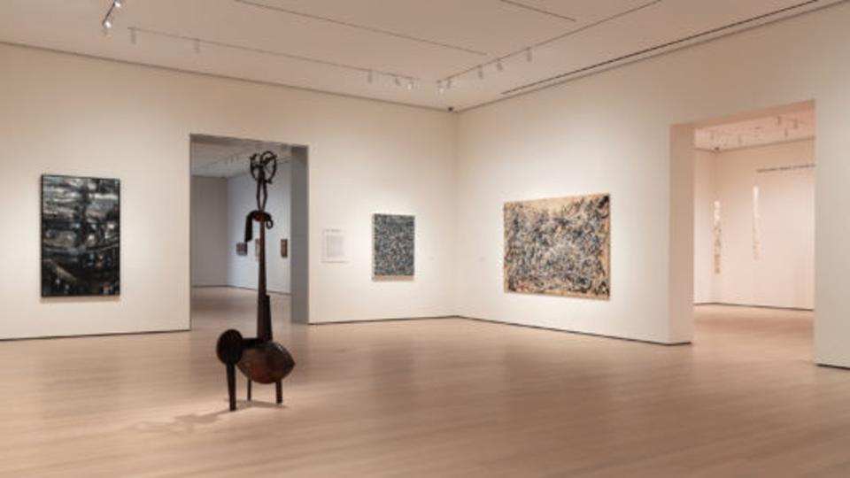
The Museum of Modern Art, newly re-opened in October after a major expansion, sidesteps the common pitfalls. There is an increase in the white space between works; the re-hang gives precedence to artists neglected earlier, especially women, artists of color, and artists from parts of the world other than Europe and North America. The Haitian artist Hervé Telemaque adds to the understanding of Pop Art as an international phenomenon, and the Pakistani artist Rasheed Araeen expands the definition of Minimalism. In the first gallery devoted to Abstract Expressionism, the viewer is greeted by Pollock, deKooning, and David Smith – but also by Grace Hartigan, Helen Frankenthaler, Pat Pasloff, Lee Krasner, Isamu Noguchi and Beauford Delaney: four women, a Japanese-American, and an African-American. The matrix of art history is loosened, media are no longer separated (photography or film almost omnipresent), and masterpieces are de-emphasized in favor of a more searching exposition of the human imagination and the range of expressive solutions. The lock-step march of isms has been replaced by a meandering and discursive path. Ironically, in many instances, it is also an arrangement that fosters a situation of clear visibility – that is, a hang that makes the masterwork heroes more heroic, enhancing their aesthetic impact, while giving the supporting cast members larger roles. Picasso’s 1907 Demoiselles D’Avignon is juxtaposed with Faith Ringgold’s image of racial conflict, American People Series #20, executed in 1968. Ringgold’s image references Picasso’s Guernica, and the label asserts that the comparison intensifies “the questions Demoiselles raises about representations of women, power and cultural difference.â€Â Success! Demoiselles acquires added complexity and the Ringgold competes very well indeed next to the early Cubist breakthrough painting.Â
Best of all, one-third of the MOMA galleries will be re-hung or shifted around every six months, which means a complete re-hang every 18 months.
Another model installation is the new Islamic Gallery at the British Museum, opened in the fall of 2018, which celebrates the way in which Islamic artifacts of all kinds match form to decoration. Even humble clay water filters feature elaborate geometric piercings. The uses of calligraphy, the arabesque interweaving of plant and animal forms, the multiple elaborations of geometric patterns – all are presented with a clarity that surpasses the earlier, rival Islamic art installations at the Louvre and the Met in New York. The lowest levels of the cases have ancient Persian animal figures to engage children, and there are a variety of please-touch items supervised by a museum educator at a low table. And, to add to the pleasure of the Gallery, when I visited there was an adjacent halal café with grilled figs and a spectacular lavender honey tart.
The smartest installations are often the ones in which curatorial responsibility is turned over to the artists. At the National Museum of Scotland in Edinburgh some ancient Pict and Celt artifacts are installed against backgrounds devised by the artist Andy Goldsworthy – mud, pieces of slate and, most effectively, wooden sticks to set off the 600 B.C.E. Ballachulish figure, an Iron Age fertility figure or goddess.Â
Which brings us back to Louisville and Southern Indiana. Three recently opened galleries have ambitious programs and intriguing spaces which lend well to very satisfactory viewing spaces. Quappi Projects at 517 East Market Street in Louisville has high ceilings, excellent lighting and elegant proportions. The Moremen Gallery, on the second floor at 517 East Market Street, makes excellent use of the former glass walled offices and conference rooms for modestly scaled one-person shows. The Kleinhelter Gallery at 701 East 8th Street, New Albany (Indiana), is housed in a 19th Century brick building that offers the option of hanging on plain or brick walls. The loser in the newer gallery sweepstakes is the collection-rich Filson Historical Society (Louisville), which did not allow for adequate exhibit space in its recent expansion. The primary galleries are cramped, awkwardly lit, and require a staff member to accompany visitors who wish to visit the exhibitions.
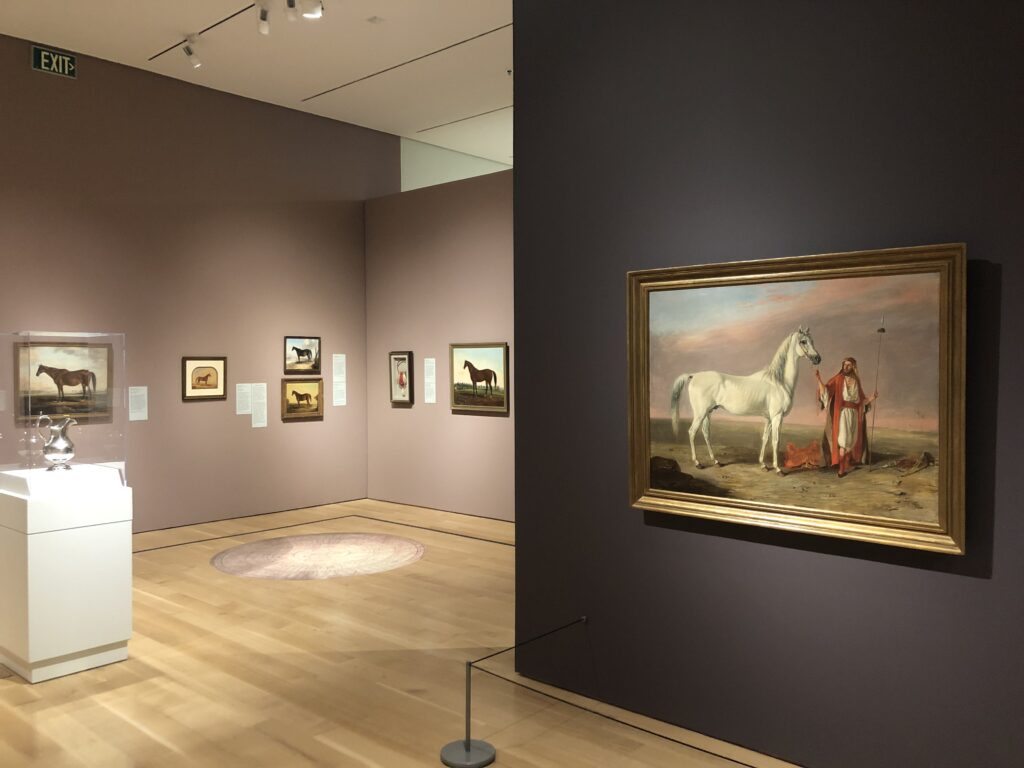
More intriguing in terms of installation is the contrast between the current exhibitions at the Speed Art Museum and KMAC (Kentucky Museum of Art and Craft). At the Speed, Tales from the Turf: The Kentucky Horse, 1825-1950 has a whopping 162 works on view, at least 140 of which depict the equine stars of the race course and breeding industry. The majority are extracted from Kentucky collections. From a museum-strategy point of view, the subject gave the Speed an excuse for access to Bluegrass holdings that would otherwise remain behind closed doors.Â
Documentary but also laden with a romanticizing self-regard, the carefully delineated champions’ confirmations are emblems of the horse owners’ prestige: the nobility of the animals imply by extension their owners’ lofty status. Artists were partners in the thoroughbred and saddlebred businesses, and the story is told with panache in Tales from the Turf. In addition to paintings there are prints, silver trophies, artists’ tools, a map of the Bluegrass, a circular pedigree diagram, an example of the actual purse that was presented to a winner in the 19th Century, and a bronze masterpiece of a jockey and rider by the art moderne sculptor Wilhelm Hunt Diederich, who employed a simplifying cubist geometrification.
The introduction to the show includes three paintings by the greatest 20th Century equestrian painter, Sir Alfred Munnings.  In Going Out at Epsom from 1929-1930, Munnings’s alla prima brushwork, especially in the clouds that surmount the scene, complements the energy, excitement and nervousness before a race. The three Munnings paintings are real zingers, and placement opposite the entrance to the show provides an upbeat introduction. The gallery-goer is then carried along by six different wall colors, from pale to dark blue, and a sequence of mauve-eggplant hues. Wall texts, wall text illustrations, varied rhythms of spacing of pictures on the wall, and the piped in sound of clopping horses’ hooves – all keep attention at a high level despite the show’s repetitiveness. There are also some great curatorial mysteries to be solved, for example, the detection of an American horse altered to appear to be English. In Edmund Troye, the show has a major master whose place in the pantheon of great American painters needs to be more widely acknowledged. The show concludes with three newsreels of Kentucky Derby races from the 1940s.Â
A complete contrast is the KMAC installation of “Picasso: From Antibes to Louisville.†It is remarkably understated. The walls are off-white, the pictures are lined up with little variation, and labels are remote, printed out on plasticized sheets. The show consists of three galleries, a timeline, a video about the founder of the Musée Picasso in Antibes, France, and photographs of Picasso at work by Michel Sima. The first gallery has a reproduction of Picasso’s 1946 Joy of Life, a painting which shows Picasso in a playful, relaxed mood after the horrors of the war years. The rest of the gallery is devoted to preliminary studies for the Joy of Life, and still lifes from the same year. In this period Picasso was visiting Matisse every two weeks, and the interchange with the older master is apparent. Picasso, as he had done repeatedly throughout his career, took on the mantle of classicism: the spare graphite studies are of a centaur and several fauns, many playing the regional duale double barreled flute. They are accompanied in the studies by extraordinarily zaftig nymphs with ballooning breasts. But these mythological fantasy drawings are not easily dismissed on sexist grounds: Picasso’s lyrical line and the taut compression of his contours imply acrobatic vitality and a division of space that activates every sheet. Â
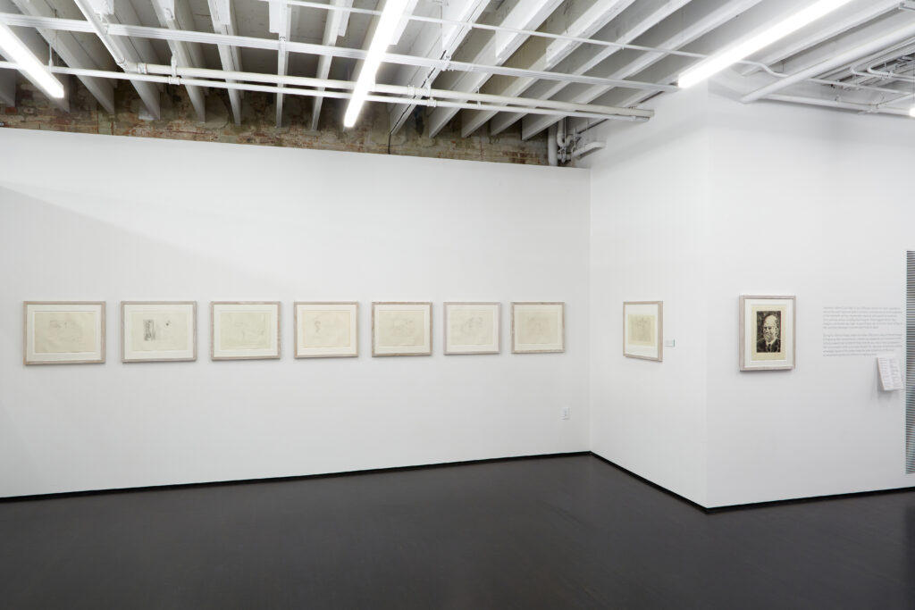
A second gallery has a selection from Picasso’s Vollard Suite, installed in a flat-footed manner, eight vertical prints followed by eight horizontals. Turn the corner and there is Picasso’s portrait of the maestro art dealer Ambroise Vollard, who commissioned the suite that preoccupied the Spaniard from 1931 to 1937. Picasso makes his viewers complicit in his male gaze: we are voyeurs witnessing the gaze of the middle-aged males in the prints. The linear contours of the female nudes in these prints have their clearest precedents in Greek vase painting. Sexuality, death, aggression, evil and innocence are some of Picasso’s themes: in effect, Picasso addresses the tissue of human relations, love and antagonism, with classicizing men and women, horses and Minotaurs. Blind Minotaur Guided through a Starry Night by Marie-Thérèse with a Pigeon, aquatint, drypoint, and engraving, executed in 1934-1935, encompasses the emotional extremes Picasso invested in the Minotaur, symbolizing lasciviousness but also guilt; violence but also despair. Â

The last gallery is reached from a corridor with a very informal Picasso timeline, a nice contrast to the buttoned-up installation of the rest of the show. A selection of prints done between 1952 and 1956 demonstrate Picasso’s experimental approach to printmaking and include lithographs, silkscreen and aquatint.
So ultimately does installation matter? In the case of the Picasso show at KMAC, the underplayed arrangement is a plus, allowing black and white drawings and prints to command center stage. The curatorial problem remains: how do you make the work of art mean more? How do you make the work of art more present and more accessible? How do you sustain attention? Each exhibition and each exhibition space demand different solutions.
Tales from the Turf: the Kentucky Horse, 1825-1950 , Speed Art Museum, 2035 South Third St., Louisville, KY, 40208. Closes March 1st.
Picasso: From Antibes to Louisville, KMAC Museum, 715 West Main St., Louisville, KY, 40202. Closes March 22nd.

