As humans, we want to categorize the images we see within a binary of good or bad, beautiful or ugly. Art that exists in that in-between space can be difficult for viewers to comprehend. Images that are neither pretty nor revolting, or are possibly too extreme of either, can evoke a feeling of uneasiness. This place of uncertainty is where camp thrives. Camp exists as a counterculture that is, confusingly, simultaneously deeply invested in contemporary mainstream pop culture. Camp uniquely embraces the complexities of duplicity in a way that conventional understandings of art do not.
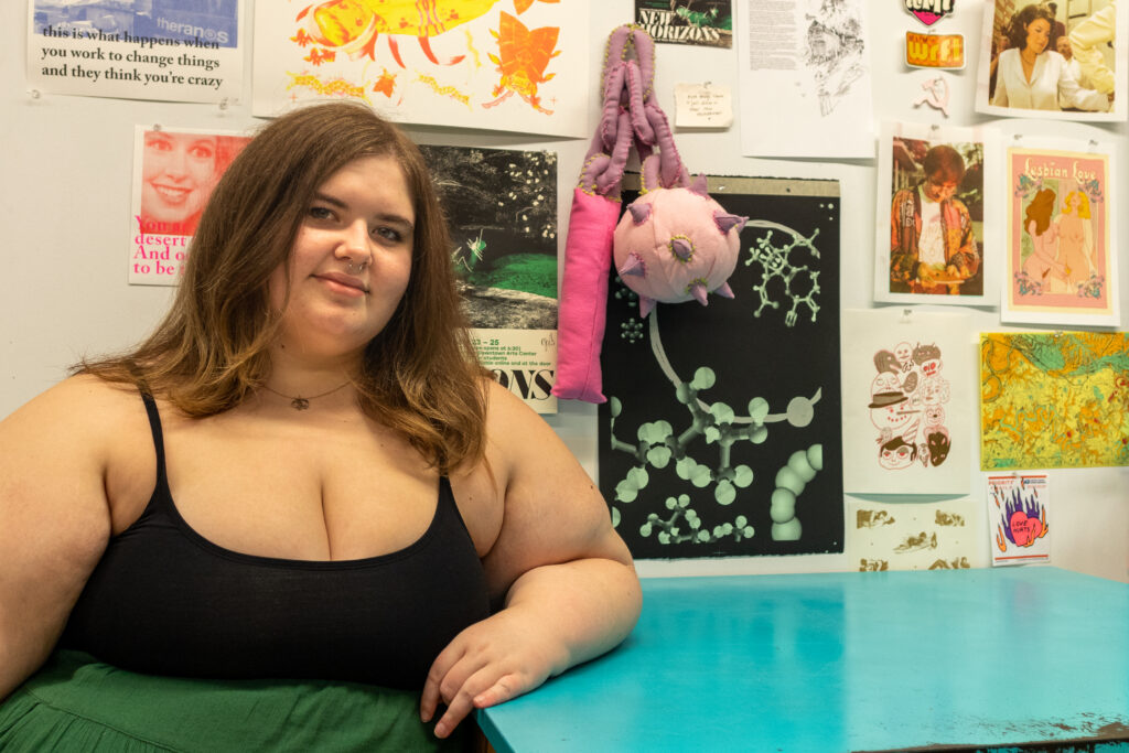
Claire Thompson, a senior BFA student at the University of Kentucky, embraces camp as a driving force behind her creativity. Celebrity icons such as Marilyn Monroe, Anna Nicole Smith, and Britney Spears serve as inspiration for the “tragically ludicrous” – a phrase coined by John Waters when defining camp in the “Homer’s Phobia” episode of The Simpsons – directions that her work takes. When I visited Thompson’s studio at UK this summer, we talked extensively about her portfolio and how the central research focus of her practice “has always been camp and the aesthetic sensibility of camp.†She emphasized that “camp is totally things that are both gross and beautiful at the same time. They’re over the top and horrible, but also great all at once.†This back-and-forth between beauty and grotesqueness carries on through all of her work.
Thompson’s first expression of camp can be seen in her paintings from earlier in her college career, when she co-opted the classic meme format and gleaned from the visual culture of the internet. Encapsulating this aesthetic required using “a lot of bad image choices with bad word placement†because of how digital content, like memes, “are obviously made quickly, and there’s no clear knowledge of the principles of design.†That lack of design rules, though, was actually “part of the whole visual language of it.†Thompson chose these unattractive, blurry, vulgar, or ridiculous photographs for the paintings in order to continue this rejection of traditional notions of “good†imagery.
The text she includes is taken from the subject of the painting itself, and embraces the multiplicity of meanings that can come from reading a phrase out of context. Swimming amidst this sometimes murky dichotomy is where Thompson thrives. She shares how images like these are the things that she is most interested in making. She is constantly working to “create things that are ‘gross’ as things that are beautiful, or things that are beautiful as things that are gross,†and this continues in her depiction of “people who represent beauty in the public eye as being grotesque figures.â€
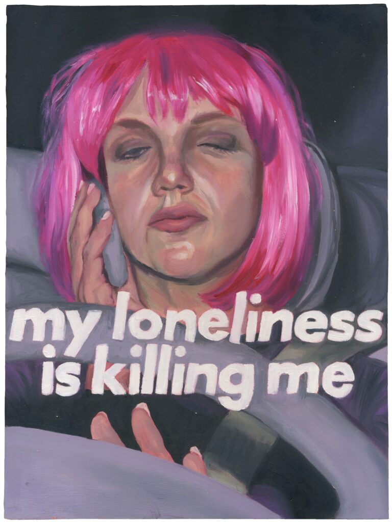
In these paintings, such as pink wig i (my loneliness is killing me) (2021), she uses celebrities like Britney Spears as case studies to explore the phenomenon of celebrity, beauty, and camp. The words “my loneliness is killing me†in this specific piece come from Spears’ hit song Baby One More Time. This song, released in 1998, is seen by some as the high point of Spears’ career. The image that Thompson decided to pair with the phrase, however, is from 2008, during Spears’ very public psychological struggles. Rather than acting as a sensual phrase of lustfulness from a lonely schoolgirl – as we see in the music video for Baby One More Time – the phrase instead exposes how Spears’ loneliness was actively damaging her physical and mental health at the time the source photograph was taken. Thompson intentionally creates this tension in the image by emphasizing the tragic nature of Spears’ very public crisis, while also poking fun at the absurd nature of her intensely pink wig and the low-brow nature of paparazzi photography. Thompson emphasizes the dazzling, chaotic, and gaudy nature of pop culture that is usually reserved for our digital spaces and instead embeds these images into the physical world of fine art and painting. With these paintings, she is “interested in the visual culture of the internet and taking digital things and making them real, or serious, in the way that traditional and physical art are considered ‘serious’.â€
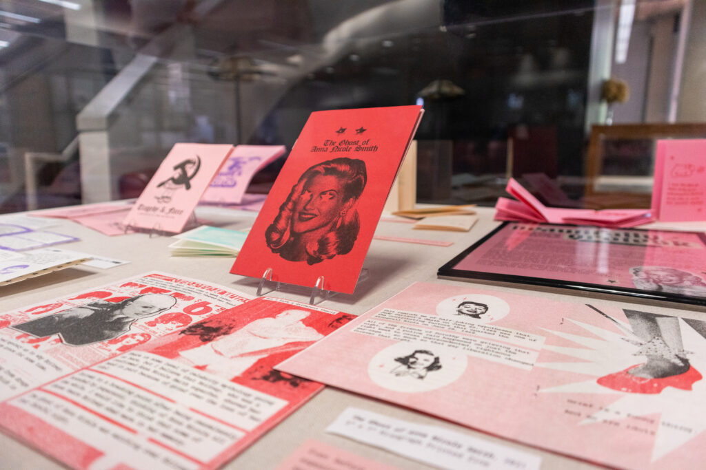
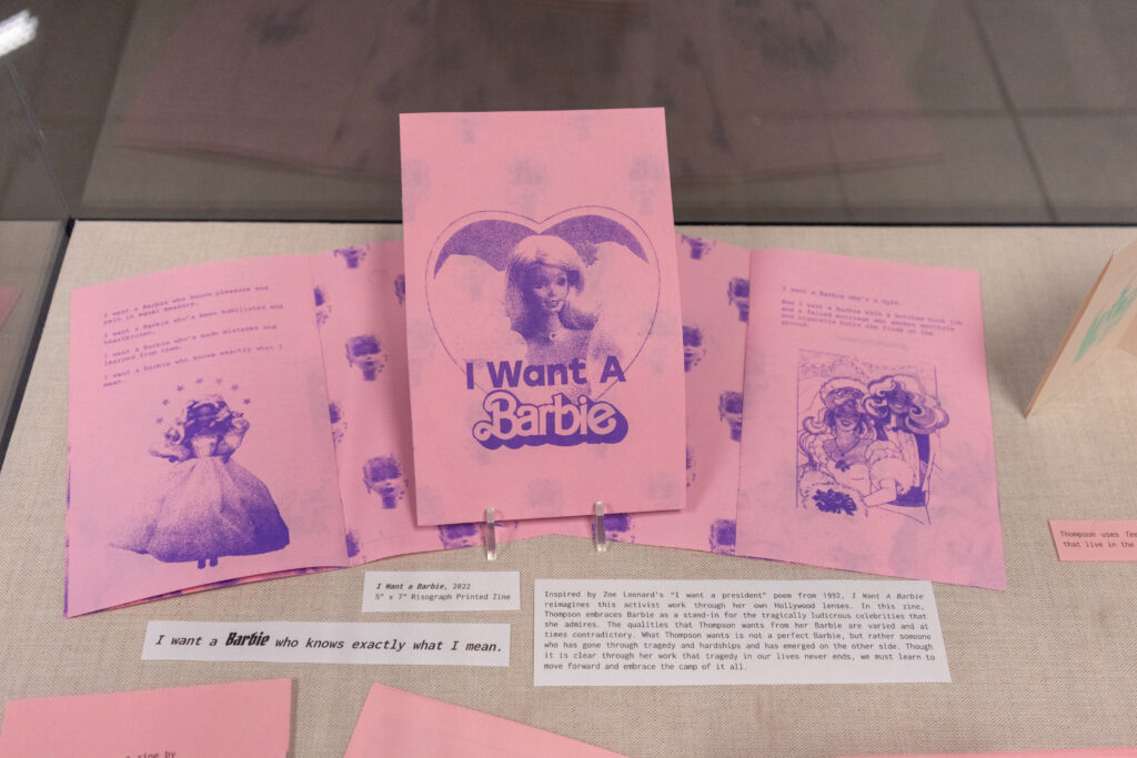
Where camp really comes alive in Thompson’s practice, though, is through her zine-making. While Thompson playfully invites the viewer into these outrageous narratives in all her work, it’s within these zines that she is able to truly express her desire for both the ugly and the beautiful. Zines are typically a small-circulation self-published collection of original or appropriated texts and images; as a medium, zines provide artists and writers with a new sense of agency in disseminating their material. Thompson explains how, since she is able to independently print her zines outside of any formal publisher, “it makes self-publishing actually a lot cheaper.†In addition to being self-published, Thompson’s zines also encourage a sense of nostalgia for print material in our increasingly digitized world. Thompson herself describes how “now it feels almost, like, radical to be able to have printed out information. Like no amount of money is ever going to be able to take this away from me.†Thompson is known for placing her printed zines in public places for free; this way, they can serve as an accessible form of print media.
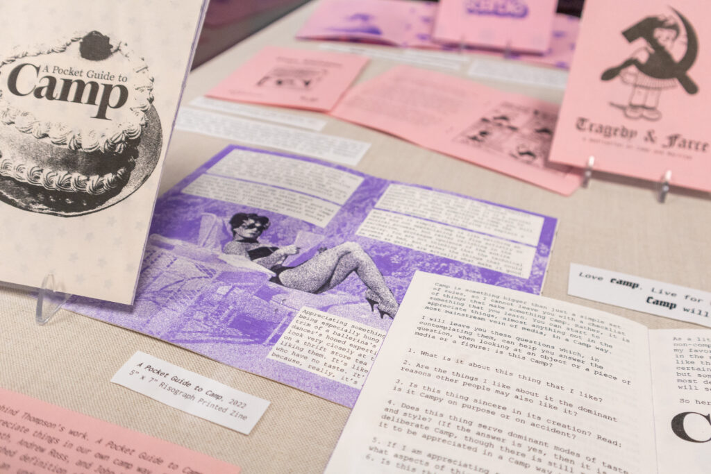
Following in the footsteps of Susan Sontag’s Notes on “Camp†(1964), Thompson created her own Pocket Guide to Camp (2022) for the modern-day reader. In this zine, she builds on the ideas of Susan Sontag, Mark Booth, Andrew Ross, and John Waters to provide us with an admittedly unfinished definition of camp. Compared to her other publications, this zine is particularly text-heavy. Thompson wanted to provide an educational tool for us, as readers, to more fully understand her inspirations. She even ends this zine with, “As a little treat, I will leave you with a non-comprehensive and incomplete list of my favorite Camp films,” for the reader to go and watch. Having this basic understanding of camp helps you more deeply engage with the wide range of zines that she has created. The content of Thompson’s zines ranges from humorous retellings of pop culture conspiracies, as we see in The Jayne Mansfield Cycle series (2022), to intense political commentary on the connections of Marxism and Camp, as seen in Tragedy & Farce (2021).
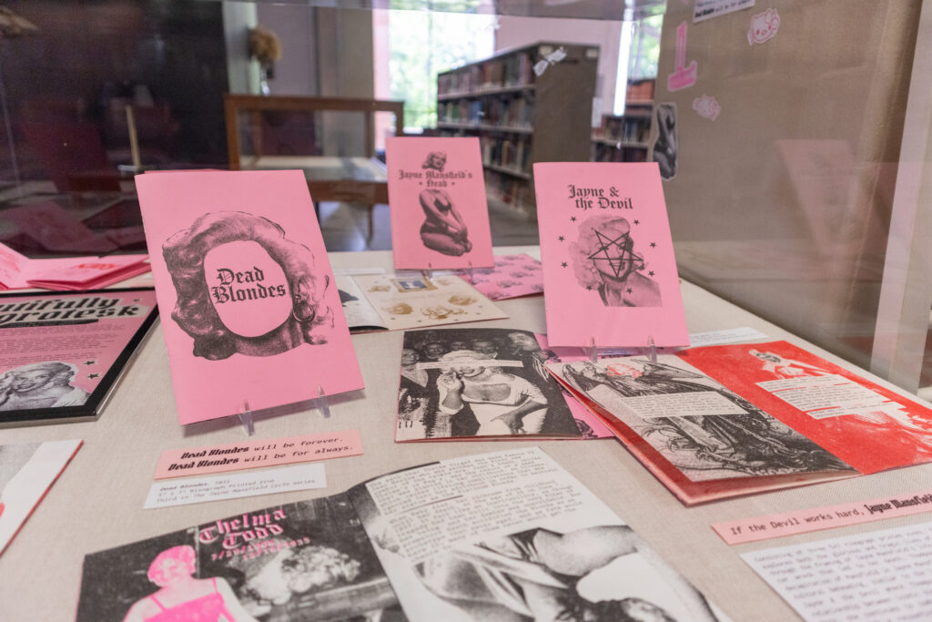
The Jayne Mansfield Cycle series, Thompson’s only grouped set of zines, thoroughly explores the complex ways that we culturally understand celebrities in relation to camp. The first zine in this series, Jayne Mansfield’s Head, provides the reader with a deep dive into one (of many) conspiracy theories surrounding the death of a Hollywood icon. Here, Thompson seems to glorify the debunked but still widespread myth of Mansfield’s decapitation. She even shares that “when Jayne died, her head was the last trophy of the Golden Era of Hollywood.†She continues this series by exploring the startling relationship between Mansfield and the dark sorcerer Anton LaVey in Jayne & The Devil. This zine unveils the potential curse that LaVey unintentionally placed on Mansfield by cutting her head off of a newspaper clipping, thus causing her death (and the subsequent rumored beheading). Thompson ends this trilogy with Dead Blondes, where she highlights the tragic deaths of blond bombshells such as Peg Entwhistle, Thelma Todd, Marilyn Monroe, and others. In this series finale, Thompson writes how “to go down the lineage of Hollywood blondes is to trace one of the main veins of movie history and the culture disseminated by the pictures created there.†These zines act as untruthful, over-the-top retellings of pop culture. In creating these works and printing them to circulate, Thompson is giving legitimacy to these low-brow images and stories. She is taking these beautiful celebrities, exposing their gross tragedies, and then spreading them to the world in a talentedly designed Risograph-printed zine. This contradictory development is intentional as Thompson wants the viewer to be tricked into consuming the grotesque by being distracted by the pretty aesthetic of the zines.
Thompson formed Grotesk Press, an independent printing press, with her printing partner, after they purchased their own Risograph printer. They recently published their second issue of Rival, a new local zine. The use of “grotesk†in their name follows the camp tradition of embracing duality. Grotesk both references the often grotesque nature of some of their publications as well as the Grotesk sans-serif typeface family. Through her own artwork as well as her projects with Grotesk Press, Thompson continues to embrace the ludicrously tragic nature of camp and create her own beautifully grotesk world.
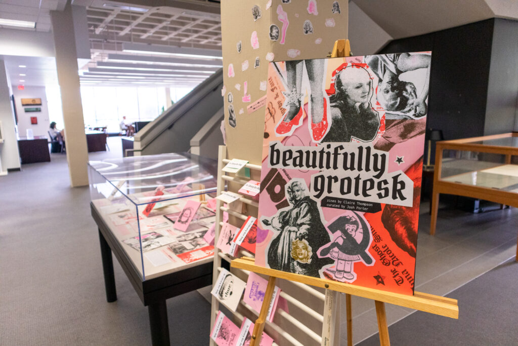
I had the distinct pleasure of curating Beautifully Grotesk, an exhibition of zines by Claire Thompson, on display at the Lucille C. Little Fine Arts Library at the University of Kentucky through the end of 2022. You can also view this exhibition virtually at www.itsjoshporter.com/beautifully-grotesk. To learn more about Claire Thompson, visit her website.
Top image: Claire Thompson, “Rival: Vol. I,” 5.5″ x 8.5″, Risograph-printed zine. Photo by author Josh Porter.
